Posts

Showing posts from February, 2018

Post 58: Final Cut

Image
FINAL CUT Here is the Final Cut of our music video for the Strokes - 'I'll try anything Once': HERE .

Post 57: Feedback of Final Cut

Image
FEEDBACK OF FINAL CUT Feedback on final cut: To gather and gain feedback for our final music video, we asked people to watch our video and look at our ancillary tasks to tell us what they thought was positive about it and where we could improve for future references, say if we were to do this again.  - we created a video response: - along with some other feedback for the music video: - and for the ancillary tasks: DG & LR

Post 56: EVALUATION Q.4

Image
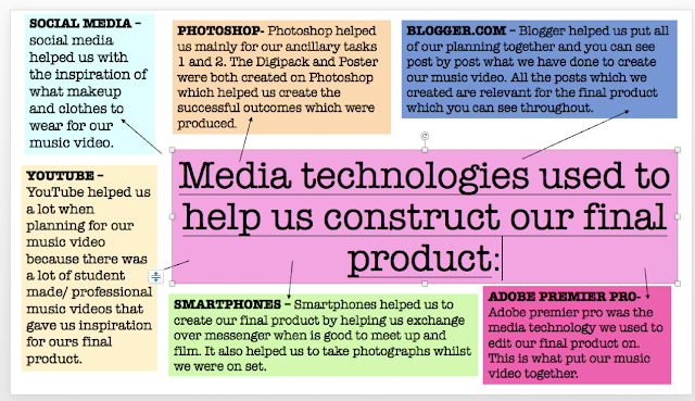
Q.4  How did you use media technologies in the construction and research, planning and evaluation stage? During A2 (year 13), we have gone through a complex process of constructing and completing our music video. At each stage - during the research, planning and evaluation - we have used a massive range of media technologies from powerpoint and editing suites to a blog and youtube.  For my AS coursework it was the first time I had come into contact with a lot of the technologies that you need to make films and media related products. Since the end of AS, I have expanded the amount of technologies even further, as my skills in the subject have developed.   All of the products above, mainly Photoshop and Adobe premier pro were the most useful, but also a challenge to use. We were having to learn how to use them through our own knowledge (which in some areas was proven difficult) because if you didn't know how to use a certain tool or editing technique, you would have to res

Post 55: EVALUATION Q.3

Image
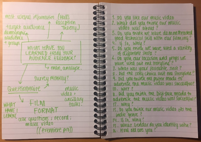
Q.3 WHAT HAVE YOU LEARNED FROM YOUR AUDIENCE FEEDBACK? Firstly, here is my plan for answering Evaluation Question 3:  THE QUESTIONNAIRE: Some answers from three different people taken verbally after they have watched the music video and looked at the ancillary tasks, (the poster and the Digi-Pak): Then, I asked one woman aged 51+ and two boys aged 17 to answer it. Here were their responses:  - woman (purple pen) - boys (black pen) - A video we created taking some more answers: What have I learnt from my audience feedback? To gain feedback I wanted to specifically talk to people who were part of my target audience, which was younger people, but I also spoke to few people from an older generation to make sure it was inclusive. I did this by showing people my music video on youtube and then printing out my digi-pak and poster and presented them in the interview. I then asked them questions in a discussion or interview; but I also used

Post 54: EVALUATION Q.2

Image
Q.2 HOW EFFECTIVE IS THE COMBINATION OF YOUR MAIN PRODUCT AND ANCILLARY TASKS? For evaluation question 2, I have produced a video illustrating how we have created synergy across our three products in the design, layout, construction of representations, mise-en-scene, and colour scheme, amongst other things. I wanted to create a chatty video of me describing our ancillary tasks, because I think it best demonstrates our products if its tangible to me and I can go through each of our decisions. I feel as though I went in to a good depth of detail and explained what went wrong, why we liked it, why we used the images we did and whether the two went well together. So, here's the video: PLANNING : In preparation to evaluate our ancillary tasks, I printed out the original digipack and poster so I could show them in the video, holding them allowing it to be clear if I wanted to focus on something specifically. I feel as though having the actual ancillary tasks printed out made i

Post 53: EVALUATION Q.1

Image
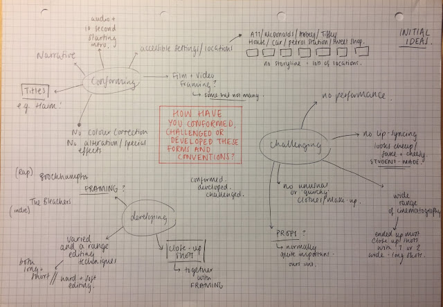
Q1. IN WHAT WAYS DOES YOUR MEDIA PRODUCT USE, DEVELOP, OR CHALLENGE FORMS AND CONVENTIONS OF REAL MEDIA PRODUCTS? 1. What media platform have you used to present your video and ancillary tasks? From the beginning we have used a blog website called blogger to help us show the making of our music video. we used it for everything; this included writing blog posts, adding images or videos from online, inserting presentations and much more. Overall, it really helped create a mood board, so we could pull visuals of what inspired us, and of what we wanted together with our idea.  We also used YouTube to upload all of the practice (i.e. experimentation footage), research (i.e. audience research), planning (i.e. our ideas) videos that we had made along with our final and rough cut to showcase properly the production of our music video and ancillary tasks. We think this is the best way to present our work because it would reach our target audience fastest. If we were to use a different pl

Post 52: Final ancillary Task 2

Image
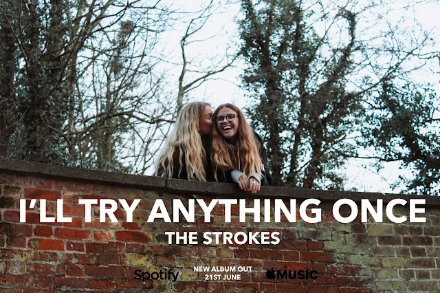
FINAL ANCILLARY TASK TWO Album Poster Displayed above is our final outcome of our album poster. We have decided to use a simple photo of the two main characters within out music video (myself and Amelia). The photo shows two girls that are laughing to one another and the camera has captured this moment they are sharing. This is a key moment in our music video, and from the perspective of an audience member, this link creates cons istency, making it easy to recognise whichever method of advertisement you look at. Looking at the photo, it focuses in on the two sisters, which is exactly what we wanted as the music video does the same. Directly on top of the photograph we have added a title of the single and the artists name in the same font but slightly smaller.  To keep it simple, we added the release date underneath the names in the same simple white font and the logos of Apple Music, iTunes and Spotify in black either side for promotional purposes. To edit our poster, we

Post 51: Final ancillary Task 1

Image
FINAL ANCILLARY TASK ONE Front and Back cover These are the final outcomes for our digipak. The front cover shows a photograph of the two girls standing on a bridge that was a key scene of our music video. We have decided to keep the front cover quite simple and as our chosen song 'I'll try anything Once' is actually a demo on a b-side, we have chosen to create the digipak as if it were part of an album. We thought about  giving the cover a more interesting feature by adding a transparent border around the edges which would have appear throughout the ancillary tasks, but we decided that it would overpower the imagery so we kept it very simple instead.  The back cover is a photograph of the trees within the image of the two girls. We then added another image showing the river that is flowing below them to overlay, creating a light textured colour, reflecting an accurate tone for our music video. I changed the opacity within this image so you could then see the image

Post 50: Feedback on our Rough Cut

Image
FEEDBACK ON OUR ROUGH CUT To get some feedback on our rough cut, I showed the rough cut of our music video to lots of people - friends, family, peers - to see what their opinions were on it and whether they had any advice on what we could do to change it/make it better.  As a class, we watched through it around three times so people could pick up the pros and cons of what they thought, because when an individual sees it only once, they may miss things (e.g. a specific shot etc.). Then, we received verbal feedback from them on what we did well and what they liked but also to see if there were any noticeable things, however big or small, which we could make better.  Next,  I showed a range of people to get a range of different age groups to see whether it changed between younger and older generations, but mostly so we could identify our target audience's improvements. Overall, t he feedback was generally positive, people seemed to enjoy the concept and thought it worked well.